
Why Your Press Sheets Don’t Match Your Proofs — Even When Both Are ‘GRACoL’
By Bill Owen – Alder Color Solutions
If you’ve ever stared at a press sheet and compared it to your contract proof thinking “Something’s off… but they’re both GRACoL, so why don’t they match?” — you’re not alone.
This is one of the most common frustrations in offset printing, and it usually comes down to one simple truth:
GRACoL is a print specification, not a guarantee.
Here are the real-world reasons your GRACoL proofs and printed sheets drift apart — and what you can do about it.
- Paper White Makes a Bigger Difference Than You Think!
Even small differences in paper shade have a massive impact on color appearance.
GRACoL defines a target white point, but in the real world:
• Proofing papers tend to be brighter
• Uncoated sheets are warmer
• Coated commercial stocks white points vary widely between mills
If the paper doesn’t match the GRACoL substrate specs closely, the entire visual match shifts — especially in neutrals and skin tones.
Solution:
Use GRACoL-certified proofing paper or simulate actual stock in your RIP if the workflow supports it. Alder Color sells proofing paper with both GRACoL 2013 and GRACoL 2006 white points. We can also help you determine which is right for your print environment. - Instrument Condition (M0, M1, M2) Matters — A Lot!
Two devices can read the same patch and claim it’s “within tolerance” while visually looking different.
Why?
Because they’re being measured using different measurement modes
• M0 → legacy tungsten
• M1 → simulates D50 and measures OBAs correctly
• M2 → UV-cut, ignores OBAs
If your proof was verified with an M1 device and your press operator is reading with an M0 densitometer, you’re not comparing apples to apples.
Solution:
Standardize on M1-only for GRACoL 2013 and later.
SIDE NOTE:
[Optical Brightening Agents (OBAs) matter. Does your proofing paper have OBAs?
OBAs are chemical additives used in textiles, paper, detergents, and plastics to make materials appear whiter and brighter. They work by absorbing ultraviolet light and re-emitting it as visible blue light, which reduces yellow tones and enhances brightness.] - Your Viewing Conditions Are Sabotaging You
This one is shockingly common.
If your press console light booth is:
• too dim
• too bright
• has aging tubes
• not truly D50
• mixed with shop fluorescent lights
• or has windows nearby… (UV light activates OBAs)
…your visual match will fall apart, even if the numbers match perfectly.
Solution:
Verify your viewing booth with a spectrophotometer and replace lamps yearly.
Alder Color Solutions can help you with a lighting audit and supply correct lamps. - Calibration Drift at the Press or in the Proofer?
Even if everything was perfect when you created your press curves, things drift:
• Coaters, blankets, and ink/water balance shift
• Dot gain changes with humidity
• RIP configs change
• Proofer heads age
• Internal calibrations expire
• Ink manufacturer changes
• Plate manufacturer changes
• General wear on equipment
A GRACoL match requires ongoing maintenance. It’s not a one-time event.
Solution:
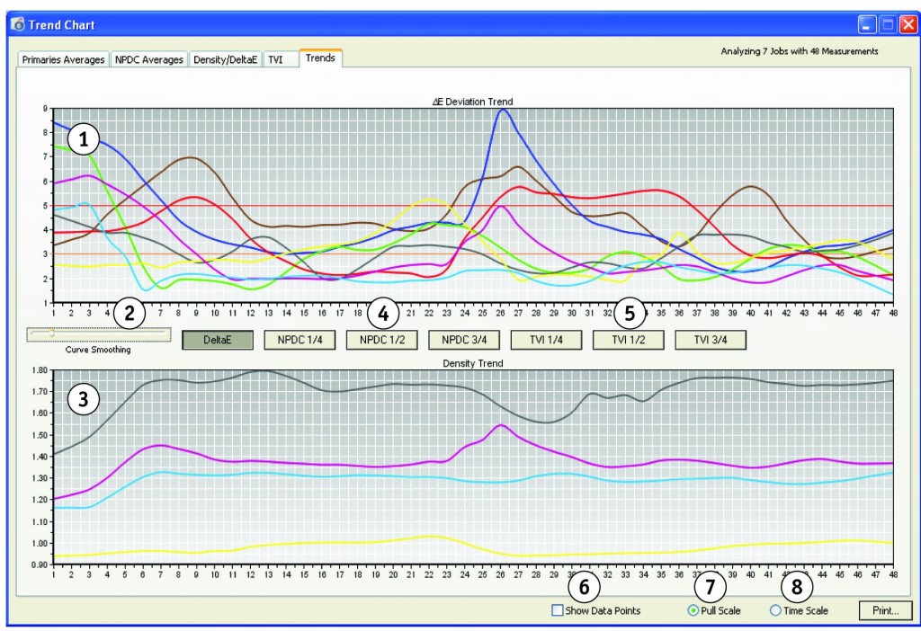
Monitor color conformance from every job, using measurement data from production make-ready color bar. At minimum – re-run G7 or GRACoL calibrations at regular intervals. - Over-Focusing on ΔE Instead of Print Behavior
ΔE is important, but it doesn’t tell the whole story.
A print can be within ΔE tolerance yet still look wrong because:
• Gray balance isn’t right
• TVI curves aren’t neutral
• Ink trapping is off
• Midtones aren’t behaving like the proof simulation
GRACoL and G7 are systems, not a single number.
Solution:
Prioritize LAB, gray balance and TVI curves, not just ΔE.
The Bottom Line
When your proofs and press sheets don’t match, it’s almost never a single failure — it’s usually a combination of small mismatches that can be corrected:
• Ink/Paper
• Instruments
• Lighting
• Calibration
• Process stability
Get those aligned, and suddenly your press sheets and proofs will match — and you stop wasting makeready time and chasing color that was never going to match in the first place.
We have some of the world’s best color experts on staff at Alder Color Solutions. We are ‘Color IT Experts’. Give us a try. We’d love to help.
Contact Bill Owen directly at: [email protected]