Color Management · Guides
Color Conformance: How Printers Measure Whether Color Actually Matches
From density to Delta E.
In our last post, Do You Measure Color, or Do You Eyeball It?, we asked five questions about where your shop measures color: displays, press sheets, proofs, and the verification step most shops skip. The short version was that eyeballing gets you an opinion and measuring gets you proof.
We ended with a promise to take on what counts as close enough. Before we can answer that, we need a shared way to say how far apart two colors are. That's what this post covers, and it's the foundation of color conformance: answering one question with data instead of opinion. Does this color match the color it's supposed to match?
Density: The Number Every Press Operator Knows
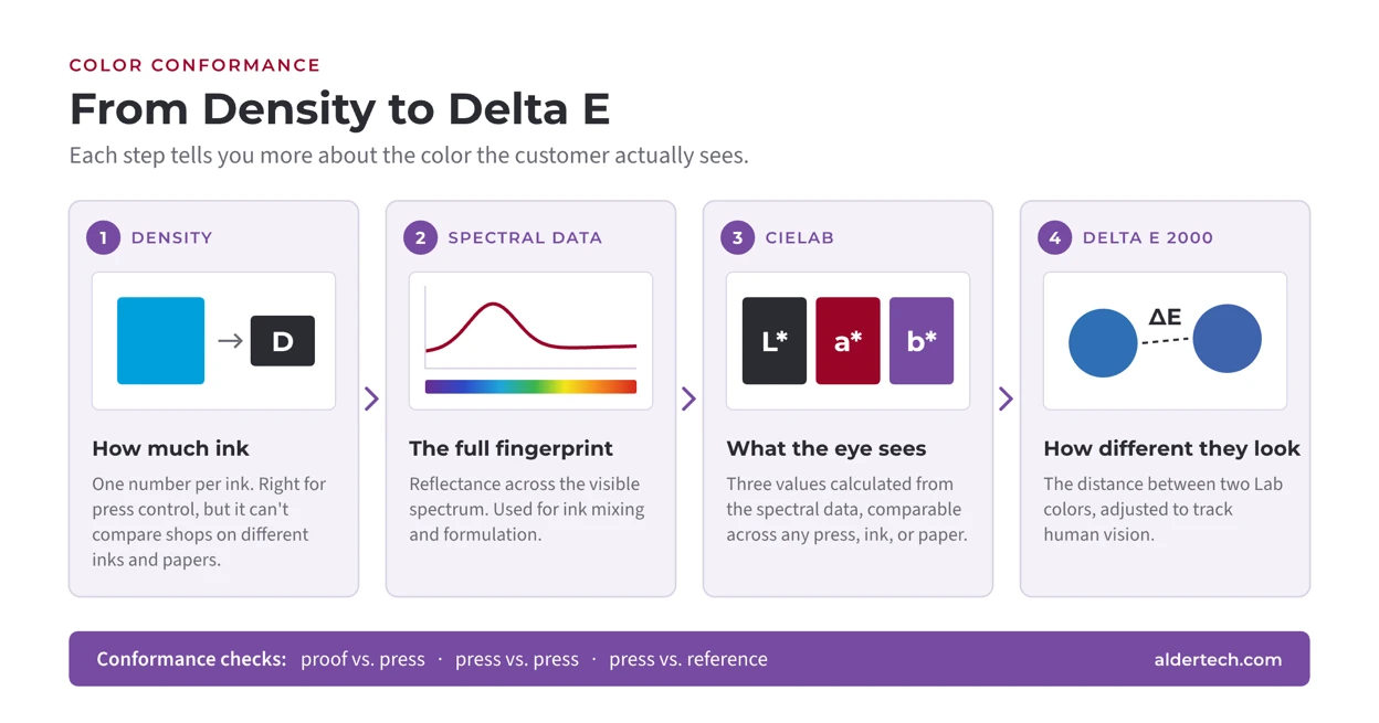
Every experienced press operator measures density during makeready and throughout the run. Density is a simple, fast measurement that gives you one number per ink. It tells you how much ink is on the sheet, and it's the right tool for keeping a press consistent from the first approved sheet to the last.
Last time we said density can't tell you what color the customer will see. Here's why that matters for conformance. Say I tell you my press runs cyan at 1.4 and yours runs cyan at 1.6. (These are illustrative numbers, not targets.) What have we learned about whether our colors match? Almost nothing. We might be using different inks on different papers. A higher density on one stock can produce the same visible color as a lower density on another, or a completely different one. The comparison isn't wrong so much as meaningless.
Density measures ink. Conformance needs to measure color.
Spectral Data: The Complete Record of a Color
A spectrophotometer measures how much light a sample reflects at each wavelength across the visible spectrum. The result is a spectral curve, a detailed fingerprint of the color that can be compared no matter whose ink or paper produced it.
Spectral data has direct uses in the shop. Ink mixing and formulation are the most common: when you need to match a spot color, the spectral curve tells the ink formulation system what it's aiming for. For day-to-day comparison, though, a full spectral curve is more information than you need. Comparing two curves point by point is not how anyone wants to approve a press sheet.
CIELAB: Three Numbers That Describe What You See
So we use a simpler system called CIELAB, usually written L*a*b* or just Lab. Lab values are calculated from the spectral data, and they describe a color with three numbers:
- L* is lightness, from black to white.
- a* runs from green to red.
- b* runs from blue to yellow.
Those three numbers place any color at a specific point in a three-dimensional color space. And because Lab is built around how people perceive color rather than how much ink went on the sheet, two Lab values can be compared directly, regardless of press, ink, or substrate. As we said last time, this is the language brand specifications are written in, and it's the language conformance testing uses.
Delta E: How Far Apart Are Two Colors?
Once two colors are points in Lab space, you can measure the distance between them. That distance is called Delta E, sometimes written as ΔE. Same thing, different notation. Delta E represents how much difference a person would see between the two colors. A small Delta E means the colors look nearly identical; a larger one means the difference is easier to see.
There's more than one way to calculate Delta E. The one most of the industry uses today is Delta E 2000. It's a refined method that accounts for the fact that the human eye isn't equally sensitive to differences everywhere in color space. We notice some shifts in neutrals, for example, more readily than equal-sized shifts in saturated colors. Delta E 2000 adjusts for that, so the number tracks more closely with what people actually see.
The practical upshot: Delta E turns "these look a little different" into a number you can record, compare, and set a tolerance against.
Three Conformance Checks Worth Running
With Lab and Delta E in hand, conformance testing comes down to measuring the same set of color patches on two things and comparing them. A few comparisons do most of the work in a typical shop.
Does Your Proof Match Your Press?
The proof is a promise about what the press will produce. Measure a control strip on the proof and the same strip on a press sheet, compare the Lab values, and you know how well that promise is being kept. If proof and press disagree, you'll hear about it from a customer eventually. Better to hear it from the measurement first.
One thing to watch here is optical brightening agents, or OBAs. Many papers contain them to make the sheet look whiter. OBAs absorb ultraviolet light and give it back as visible blue, so a sheet with OBAs looks different depending on how much UV is in the light. If your proof stock has OBAs and your press stock doesn't, or the other way around, the two can match in one light and not in another. It's worth knowing what's in both stocks before you compare numbers.
Does One Press Match Another?
If a job can move between presses, or between plants, the customer expects it to look the same no matter where it ran. Measuring the same patches on both presses tells you whether that's true, and if it isn't, where the difference lies.
Does Your Press Match Your Reference?
Every shop needs a gold master, the color it's aiming for. For many commercial printers that's a published reference such as CRPC6/GRACoL 2013. For packaging, it may be a brand's approved standard. Comparing press output to that reference is the most fundamental conformance check there is, because it tells you whether you're hitting the target everyone else is measuring against.
In each case, the answer is a set of Delta E values instead of a judgment call made under whatever lighting happens to be nearby. That's the measurement file we talked about last time. When a brand owner asks how you know the job matched, this is the answer.
Where This Goes
Measuring is the first step, and Lab and Delta E give you a common language for the results. Last time we said the next question was what counts as close enough. Now that we have a way to put a number on the difference between two colors, we can answer it properly, and that's where we're headed next.
Talk to Us About Color Conformance
Alder Color Solutions helps printers and converters set up conformance checks that fit their workflow, from choosing the right instrument and reference to building the process that measures, compares, and records results. If you want to talk through how your proofs, presses, and references line up, get in touch.
Or email loup@aldertech.com · Color Management • G7 • Process Control
About the Author
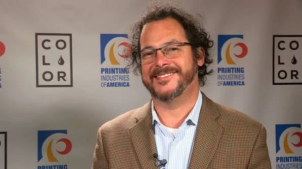
Lou Prestia
General Manager, Color Services
Lou holds a B.S. in printing science from RIT, including two co-op internships in the prepress group at the National Geographic Society. He was at Barneyscan as the desktop publishing revolution was getting started, then at Adobe as Color Evangelist when ICC profile support was first added to the applications that are now Creative Cloud.
He earned G7 Expert certification in 2006, as the program was starting, and G7-calibrated dozens of presses through his own consulting practice before returning to corporate color roles at EFI, Pantone and X-Rite. He sits on the Print Properties Committee of PRINTING United Alliance and is Great Western Ink's technical representative for Northern California.
Questions? Contact Lou at Alder Color Solutions: Email: loup@aldertech.com