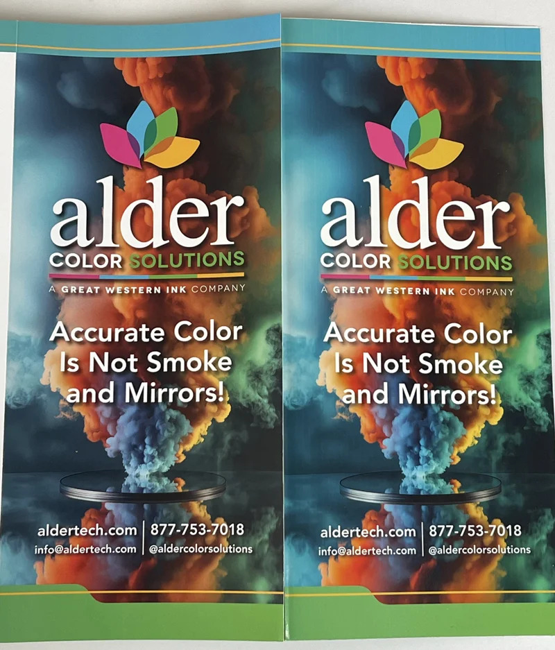
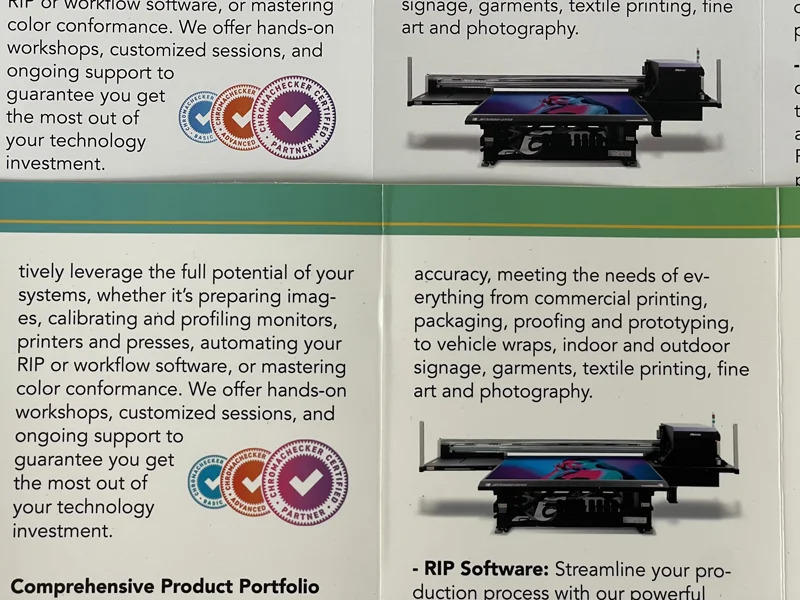
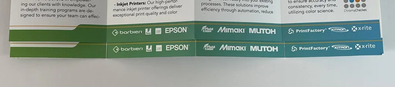
Recently we decided to produce a new brochure highlighting the products and services we provide. We chose one of our clients, Premier Press in Portland, OR, to print it. They've invested in and implemented our Alder Color Control platform, so they were the obvious choice — give them some business, and see how well they're doing with the color training and tools we've provided. What followed is a good real-world example of why standards — specifically GRACoL / CRPC6 and G7 — matter so much. We deliberately did not ask Premier Press for a proof. Instead, we generated our own verified proof in-house — and never let them see it. Then we compared their printed brochures against it. Two honest caveats before you look at the photos. First, there's banding in our proof (oops!). Second, two real-world variables were in play: their paper was slightly bluer than the spec and our proofing stock, and we had a matte coating applied to the finished brochures. You can see they're extremely close in color, with the differences mainly in paper white and overall sheen — exactly the two variables we knew going in (the bluer stock and the matte coat). The color itself lands. By using G7 curves and/or ICC profiles and targeting the same standard on both ends, we were able to produce proofs in-house that very accurately represented how the files would actually print — on a press we don't own, in a plant we weren't standing in. And Premier Press did an outstanding job of having their digital press set up and running to the standard. They're verifying their conformance daily to ensure the highest quality, and they can produce the data and conformance report should a client be interested in the geeky color science behind their printing. That's the whole point of a shared standard: both sides aim at the same defined target, and the match stops being a matter of luck or negotiation. Thank you to Premier Press for trusting us with their color management and process control products, tools, and training — and for printing our new brochures at the highest level. Want to run this experiment on your own workflow? Download our brochure PDF and print it yourself. Then send a request to info@aldertech.com and we'll mail you a printed brochure so you can visually compare it against your own output. It's a simple, honest gut-check on how close your press really is to the standard. As always — if you need help achieving accurate, consistent color in print, contact us. Director of Technical Services, Alder Color Solutions Dan has spent more than three decades helping printers, converters, publishers, packaging companies, and photographers get control of their color — across offset, flexo, wide-format, digital, and packaging production. He founded the color consultancy ColorGeek Inc. in 1999 and joined Alder in 2018. A certified G7 Expert since the inaugural 2006 class, he has spent nearly twenty years implementing G7 and international print standards in real production environments, and was one of the few certified instructors for the SGIA Digital Color Professional program. He's also a professional photographer — which keeps him fluent in both the artistic and technical sides of imaging.The Test: No Proof Requested
The Side-by-Side Comparison
Why It Matched
Try It Yourself
Schedule a Consultation
info@aldertech.comAbout the Author

Dan Gillespie