Color conformance answers one simple question: is the press actually printing to the intended standard or print specification? A press sheet can look good and still be out of tolerance. At Alder Color Solutions, we use our Alder Color Control Platform (ChromaChecker) to measure press performance against defined targets such as GRACoL, SWOP, SNAP, G7, CRPC, ISO-based print conditions, or customer-specific requirements and custom targets. The chart above is ChromaChecker's Ink GPS view. Each ink gets a Parafarb curve, which plots color error (ΔE) against solid ink density. It answers a question a densitometer cannot: at what density does this ink actually hit its target color? We call that density the "sweet spot." Every ink has its own tolerance window, and no two are the same width. The left edge is the lowest density that still gives acceptable color. The right edge is the highest. Anywhere between the two edges, the color is in tolerance. The width of the window tells the operator how much room there is to work. A wide window means the ink is forgiving, and density can drift without the color going out. A narrow window means the ink needs tight control, and small density changes will push it out of tolerance. Knowing which inks have narrow windows tells the pressroom where to focus. The goal is to run each ink near the center of its tolerance window, not at the edge. A press running at the edge of the window passes today and fails on the next drift. In the image above, each ink is running at or near its sweet spot. The dot is easy to read. If the dot sits inside the green window, that ink is in tolerance. If the dot is left of the low point, more ink will bring the color closer to the target. If it is right of the low point, the press is running too much ink and the color is moving away. The most valuable thing a Parafarb shows: if the bottom of the curve never drops below the green line, no density setting will bring that color into tolerance. The problem is the ink or the substrate, not the ink keys, and the operator can stop chasing it on press. In other words, that ink has no tolerance window at all. In this example, all four inks are in tolerance: Each dot sits inside its tolerance window, so the operator knows the press is producing the right color, not just the right amount of ink. Color control is more than density. Density tells you how much ink is on the sheet. It does not, by itself, tell you whether that ink is the right color. Conformance evaluates the actual color result against an established target: primaries, overprints, substrate, gray balance, tonality, G7 performance, and overall variation. That gives the press operator objective direction instead of relying only on visual judgment. Measure. Compare. Correct. Verify. The summary turns a full set of measurements into a single line per sheet. Each column is a check against the target: In the example, sheet 19, measured July 22, 2026, passed every check for 100 percent conformance. That is a result the printer can show a customer as proof that the press is within tolerance and properly calibrated. A press can be consistent and still be consistently wrong. Printing to a recognized specification creates a common target for prepress, proofing, pressroom production, and the customer. It reduces makeready time, waste, press-to-press variation, and color disputes, while giving the printer measurable proof that the process is under control. The goal is not simply "It looks good." The goal is: "It measures correctly, conforms to the specification, and we can prove it." If you want to know whether your press is printing to specification, Alder can help you set up the measurements, targets, and reporting, and interpret the results. Lead Color Specialist, Alder Color Solutions Bill is an Idealliance-certified G7 Expert and founder of Elevated Color, with more than 45 years in prepress, printing, and color management — including over 25 years dedicated to helping printers achieve predictable, repeatable color across commercial, packaging, wide-format, offset, digital, and inkjet work. He specializes in G7 implementation, ICC profiling, press and monitor calibration, proofing systems, and workflow standardization, with deep experience across RIPs including EFI Fiery XF, PrintFactory, ChromaChecker, Onyx, Caldera, and Xitron Navigator, and platesetter workflows such as Agfa Apogee, Kodak Prinergy, Esko, and Heidelberg Prinect. His work has appeared in PRINTING United, Idealliance, and WhatTheyThink.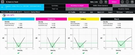
1. Reading the Parafarb: where density meets color
2. The tolerance window
3. Reading the dot
Ink
Measured density
Expected density
Result
Cyan
1.382
1.363
Pass, slightly heavy
Magenta
1.436
1.436
Pass, on target
Yellow
1.063
1.074
Pass, slightly light
Black
1.676
1.676
Pass, on target
4. Why conformance matters
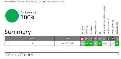
5. What the summary report shows
Printing to a Standard
Getting Started
billo@aldertech.comAbout the Author

Bill Owen
Phone: 720-933-4413