
Case Study · Home Décor · Wide-Format

70+ wide-format printers — and the color problem started before the press

A worldwide home décor brand prints every one of its 1,000+ designs in house, on more than 70 ten-foot-wide inkjet printers. We were brought in to talk about process control on the press floor. What we found was that color was going wrong long before a file ever reached a printer — in the camera, on the monitor, and in the artwork itself.

Client  Global home décor brand (name withheld) Model  Direct-to-consumer, printed in house Scale  70+ ten-foot-wide inkjets, multiple sites Focus  Color management from capture to press
70+
Ten-foot-wide inkjet printers
across multiple locations
1,000+
Designs in the catalog,
all printed in house
5
Upstream stages brought
under measured control
Months
Expected payback on a
minimal investment

The challenge — color starts upstream

We were asked to visit for a consultation on print production workflows, specifically around ongoing process control. The operation is genuinely impressive: multiple locations, more than 70 ten-foot-wide inkjet printers, over 1,000 designs, and an in-house photography studio shooting finished product for the online store, print advertising, and packaging.

Touring the LA headquarters, I started asking pointed questions. Were the cameras profiled? Were the monitors in the design department calibrated? They weren't. Every stage before the printer is a stage where color can go wrong — and it was. What the team was calling a press problem was really a capture, display, and file problem arriving at the press.

We recommended managing color from the very first step of the process. They hired us to deliver the training and implementation.

Profiling the cameras

We started with the photography team and studio, teaching them to build highly accurate color profiles for their cameras, lenses, and lighting scenarios.

Here's what people miss: no electronic device is accurate. Every one of them carries biases that have to be defined and accounted for to get the most accurate capture possible.

Once the profiles were built — and we could report on exactly how accurate they were — we showed the team how to apply them in post-production. Images are now automatically corrected to match the original subject matter, cutting out hours of manual correction on every shoot.

Calibrating the monitors

Next, the displays — a mix of BenQ professional graphics monitors and Apple iMacs, plus a colorimeter and software we were able to demonstrate weren't sufficient. They purchased the instrument and software we recommended.

With the right tools, we trained them to build the best possible calibration and profile for each display, and then to validate it — producing a complete, non-subjective report on how accurate each screen actually is. No surprise: the BenQ displays significantly outperformed the iMacs.

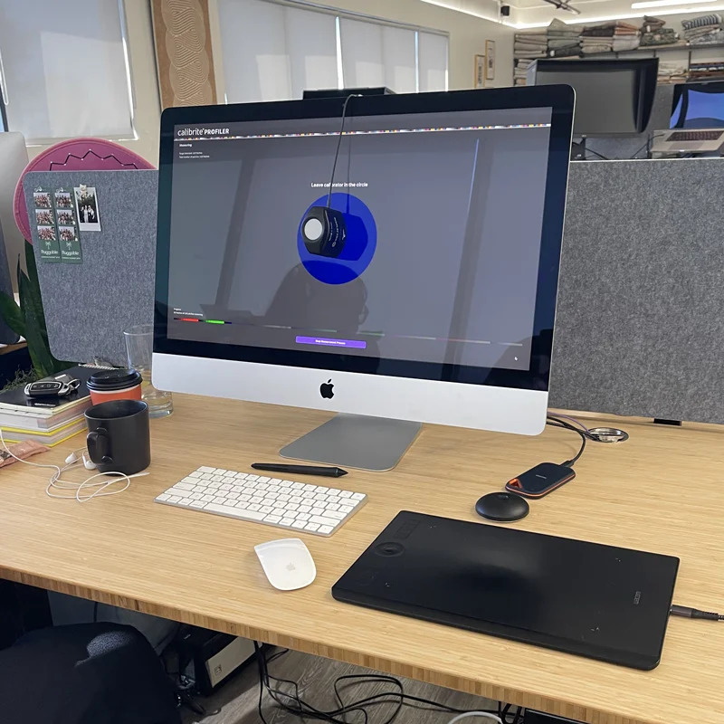
Monitor color management software calibrating and validating a professional graphics display
Monitor calibration and validation — turning display accuracy into a measured, reportable number instead of an opinion.
A note on cadence

Monitor calibration, profiling, and validation have to be done manually — we suggest quarterly, four times a year.

It can be automated on supported monitors with built-in measurement instruments. In that case we have a cloud platform where you schedule these functions and push them to displays over the internet, with an online portal showing results for every display at every location — so you can confirm everyone is seeing color accurately, in the office or at home.

Making design see what the press will do

A calibrated, profiled, validated monitor shows color accurately — but it still won't show you how the files will print.

Soft-proofing with production profiles

When an RGB file prints, it's converted to a CMYK color space and ICC profile automatically as it passes through the RIP/DFE driving the printers. So we taught the team to extract the profiles from print production and use them in design. Working in Adobe CC with their own production profiles, designers can now see how an image will look after conversion — before anything is printed. That alone cuts cycle time and keeps expectations matched to reality.

Building files properly

We spent hours training the team on how images are captured and where color conversions happen across the entire workflow — the theory of ICC color management, which nobody escapes, because it's baked into the operating system, the design applications, and the RIP/DFE alike.

They had only a basic understanding going in, and told us the technical underpinnings would help them immensely. The training also covered building artwork files correctly. Many designers today aren't especially print-savvy, so the technical nuances matter. We found several practices that weren't ideal, and we're now formulating new standard operating procedures together.

Demystifying spot colors

Spot colors are widely misunderstood. This client's products aren't printed with spot colors at all — but they frequently need to match spot colors inside their available CMYK gamut, which is a different problem entirely.

Because their printing process is very specific, we generated spot color libraries for Adobe CC that were entirely in-gamut — achievable on their equipment, with their own production profiles. We also showed them quick tools for visualizing whether a given spot color can be matched within tolerance, and what the ideal CMYK value would be to hit it.

The result

At the end of the training the team was thoroughly impressed — and, more importantly, they don't have to wonder about color anymore. They'll no longer be chasing it at the press, because they know their capabilities and can visualize them far upstream, with confidence.

This was a minimal investment that will pay for itself within a few months and keep paying for years. Next, we hope to implement the process control platform we were originally there to discuss.

Cameras profiled and reported Displays calibrated and validated Soft proofs on production profiles In-gamut spot color libraries Hours saved in post-production
"They don't have to wonder about color anymore. They'll no longer be chasing color, because they know their capabilities and can visualize them far upstream, with confidence."
Dan Gillespie Director of Technical Services, Alder Color Solutions

Why it matters for in-house production

If you design, shoot, and print under one roof, the press is the last place to find a color problem — and the most expensive. Control it at each stage instead.

Capture

Profile the camera

Cameras, lenses, and lighting all have biases. Profile them and images correct automatically to match the real subject.

Display

Calibrate and validate

Calibration isn't finished until it's measured. Validation gives you a report, not a feeling, on every screen.

Predict

Soft-proof on production profiles

Pull the RIP's own profiles into design so the team sees the printed result before committing material.

Match

Know what's in gamut

Build spot color libraries that are actually achievable on your presses — and know instantly when one isn't.

Frequently asked questions

Should color management start with the camera?

Yes. No electronic device is inherently accurate — cameras, lenses, and lighting all introduce biases that have to be defined and accounted for. Profiling the capture stage means images can be corrected automatically to match the original subject, saving hours of manual correction downstream.

How often should monitors be calibrated?

Manual calibration, profiling, and validation should be done roughly every quarter — four times a year. It can be automated on supported displays with built-in measurement instruments, using a cloud platform to schedule and push calibrations and report results across every location.

Can a calibrated monitor show how a file will print?

Not on its own. A calibrated display shows color accurately, but RGB files are converted to CMYK by the RIP or DFE at print time. To preview the printed result, extract the production profiles and use them to soft-proof in Adobe applications before printing.

Can spot colors be matched in CMYK?

Some can, some can't — it depends on the gamut of the printing process. Using production profiles you can build in-gamut spot color libraries for Adobe applications, then use tools to check whether a given spot color is achievable within tolerance and what CMYK value best achieves it.

About the author

Dan Gillespie, Director of Technical Services at Alder Color Solutions

Dan Gillespie

Director of Technical Services, Alder Color Solutions

Dan has spent more than three decades helping printers, converters, publishers, packaging companies, and photographers get control of their color — across offset, flexo, wide-format, digital, and packaging production. He founded the color consultancy ColorGeek Inc. in 1999 and joined Alder in 2018.

A certified G7 Expert since the inaugural 2006 class, he has spent nearly twenty years implementing G7 and international print standards in real production environments, and was one of the few certified instructors for the SGIA Digital Color Professional program. He's also a professional photographer — which keeps him fluent in both the artistic and technical sides of imaging.

Questions? Contact Dan at Alder Color Solutions: Email: dang@aldertech.com

Fix color at the source, not at the press

If you shoot, design, and print in house, we'll show you where color is drifting — from capture through to the printer — and what it takes to control it.

Book a color audit