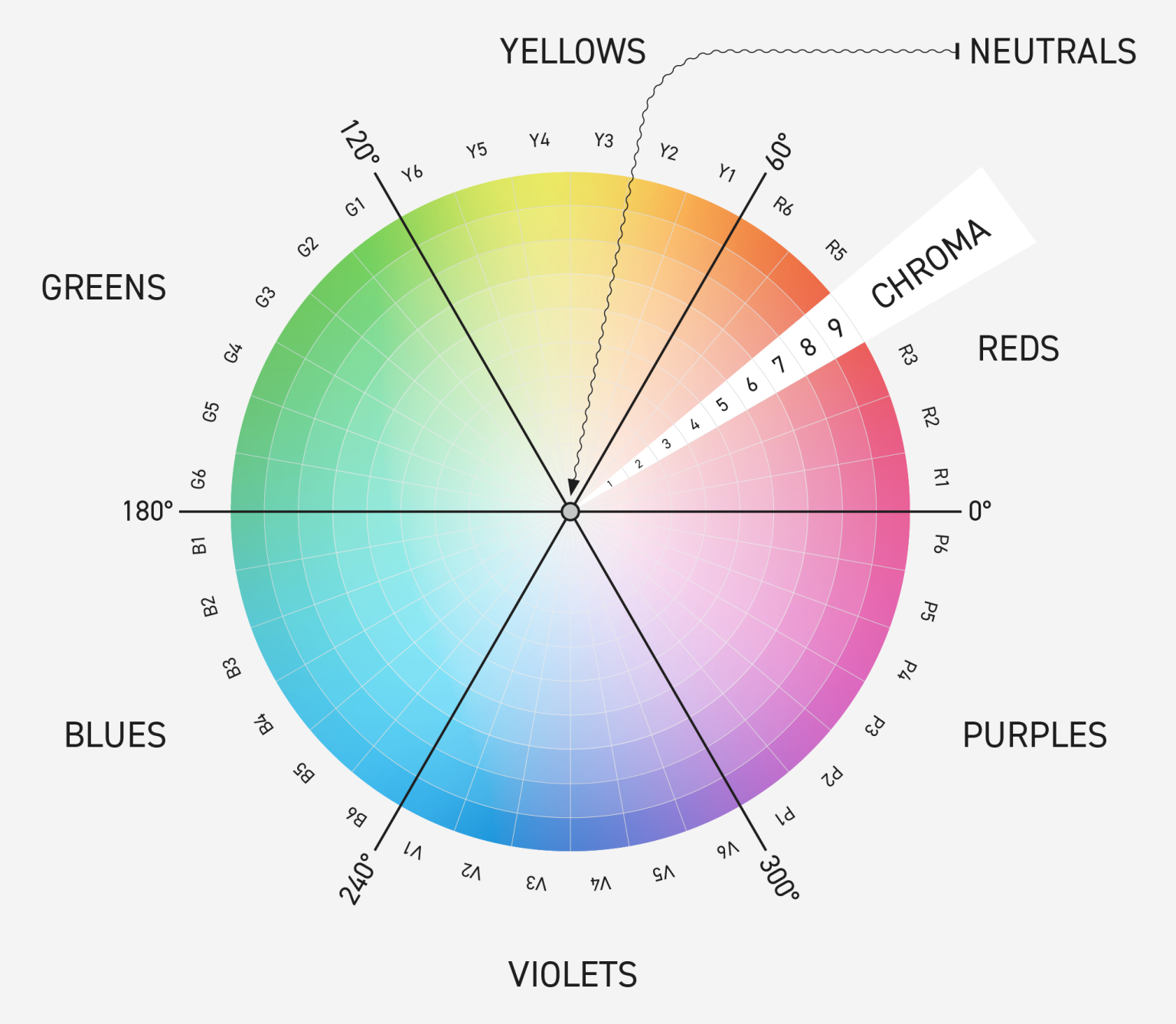
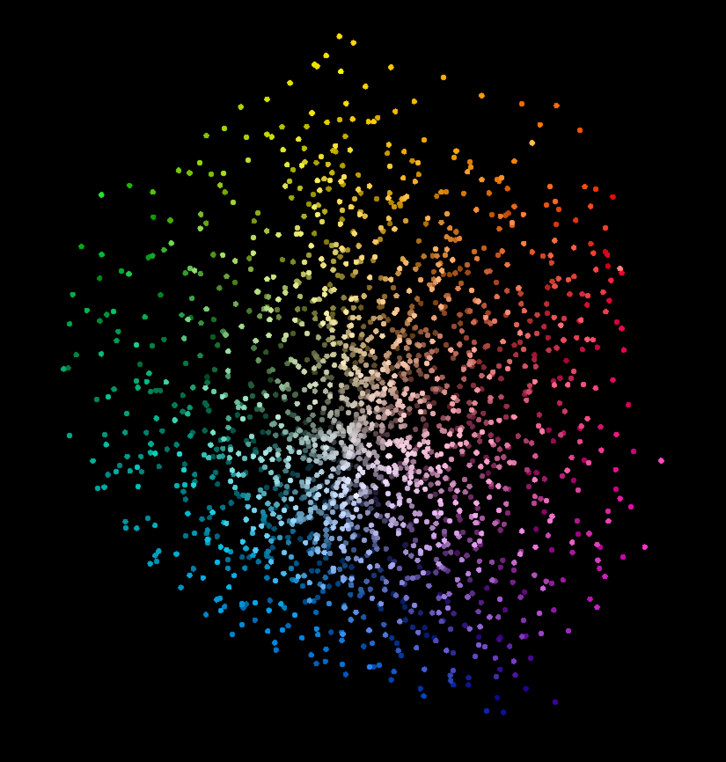
There's so much talk these days about spot colors — namely the Pantone libraries. This "matching system" has been the de facto standard used by many industries, printing especially. Recently Pantone made the decision to remove the libraries from Adobe Creative Cloud applications and charge loyal customers a fee to access them. That's left many people scrambling for what to do — and, hopefully, questioning the value and wondering if there's a better way. First, let's talk briefly about the things that aren't ideal — or are outright problematic — with this legacy model. The ever-growing libraries of colors (the Solid Coated and Solid Uncoated Formula Guides) were developed over decades, originally derived from physical Pantone inks. The result is a library that doesn't cover the color spectrum evenly — there are areas crowded with very similar colors, and other areas with almost none. The physical references — swatches and fan guides — weren't (and aren't) accurate, even when brand new, and generally cause problems rather than solve them. They're meant to be used as inspiration, not communication. And the need for a physical visual reference breaks an otherwise fully digital process. The master definition of each color — which is spectral — is not distributed. It's only accessible from Pantone's Connect/Live cloud. Only Lab-value libraries are handed out. Those Lab values differ for each measurement mode (M0, M1, M2, M3), as well as by illuminant and observer angle. For instance, the libraries that came with Adobe Creative Cloud, and the values in the current Pantone Connect platform, are M2 Lab values for D50/2°. M2 values are UV-excluded. But daylight has UV. Why would you want the UV-excluded values? You probably don't — but that's all you get. I could go on (and on), but let's get to the point. What are the alternatives? What should we be doing to define and communicate spot colors? We can't keep using named colors with variable target values, and we can't accurately print spot color tints and overprints without spectral definitions. Those definitions need to be embedded in our artwork and used throughout the process. A spectral definition can be embedded into the PDF artwork and accessed through it: an ink lab tech could use it to formulate ink; a prepress person could use it to proof the color on a monitor or printer; a pressroom person could use it to compare against when QC'ing — then share that conformance data back to the designer, brand, or print buyer to prove the match. At least the ones we've had. The swatches and fan guides printed today are only accurate for certain printing processes on specific substrates. We should be using the digital definition and proving we can view it properly on a monitor or reproduce it in print. If we do need a physical reference, we should output it on the specific machine and substrate the final product will be produced on. You can even predict an entire library of in-gamut colors using the printer's ICC profile, and save that library as an ASE (Adobe Swatch Exchange) or ACB (Adobe Color Book). The entire industry is moving in the direction I'm describing. There are ISO standards for defining and saving spectral spot colors (CxF/X) and for embedding CxF in a PDF (PDF/X-6). Adobe's PDF Print Engine (APPE) v6 — licensed by all the Adobe RIP software companies — has the functionality to interpret spectral definitions built in. (See my post on APPE v6 for more.) Customers need to pressure developers to implement this. One with colors distributed uniformly throughout the entire spectrum. One defined entirely in CxF format — open architecture, non-proprietary. One that is… free. Let me introduce you to ChromaSpot — the spot color library we've all been waiting for. It's built on a foundation of real color science and modern architecture: 3,360 spectral color definitions, engineered so that no two colors are too close (>1.5 ΔE 2000) or too far (<4.5 ΔE) from one another. Here's what makes it different, in the project's own words: In my opinion, you're looking at the wave of the future. This is how things will be done, and the time to start — or to start working toward it — is now. Please reach out with questions, or for help implementing this new process. Director of Technical Services, Alder Color Solutions Dan has spent more than three decades helping printers, converters, publishers, packaging companies, and photographers get control of their color — across offset, flexo, wide-format, digital, and packaging production. He founded the color consultancy ColorGeek Inc. in 1999 and joined Alder in 2018. A certified G7 Expert since the inaugural 2006 class, he has spent nearly twenty years implementing G7 and international print standards in real production environments, and was one of the few certified instructors for the SGIA Digital Color Professional program. He's also a professional photographer — which keeps him fluent in both the artistic and technical sides of imaging.What's Wrong With the Legacy Model
1. The libraries don't cover the spectrum evenly
2. Physical references aren't accurate
3. The true (spectral) definitions aren't distributed
4. And those Lab values are mode-dependent
Is There a Better Way?
1. We need spectral definitions
2. We need to get away from physical visual references
3. Software developers need to implement this
4. And we really need a better library
Introducing ChromaSpot
About the ChromaSpot Project
The Wave of the Future
Schedule a Consultation
Dan Gillespie — dang@aldertech.com — 717-475-9007About the Author

Dan Gillespie
Phone: 717-475-9007